Logo
The wordmark in its three approved colors. SVG scales anywhere; PNGs are transparent.


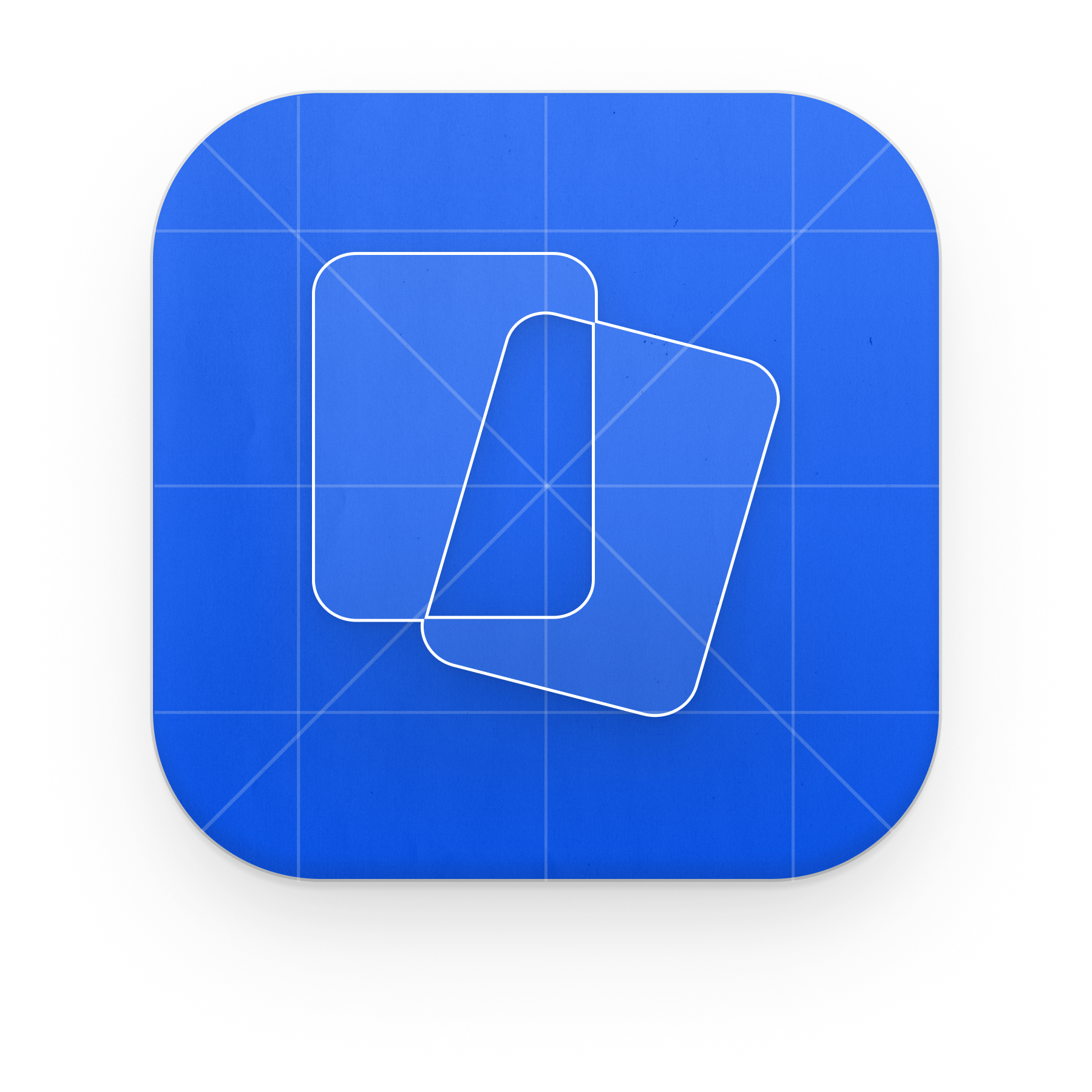

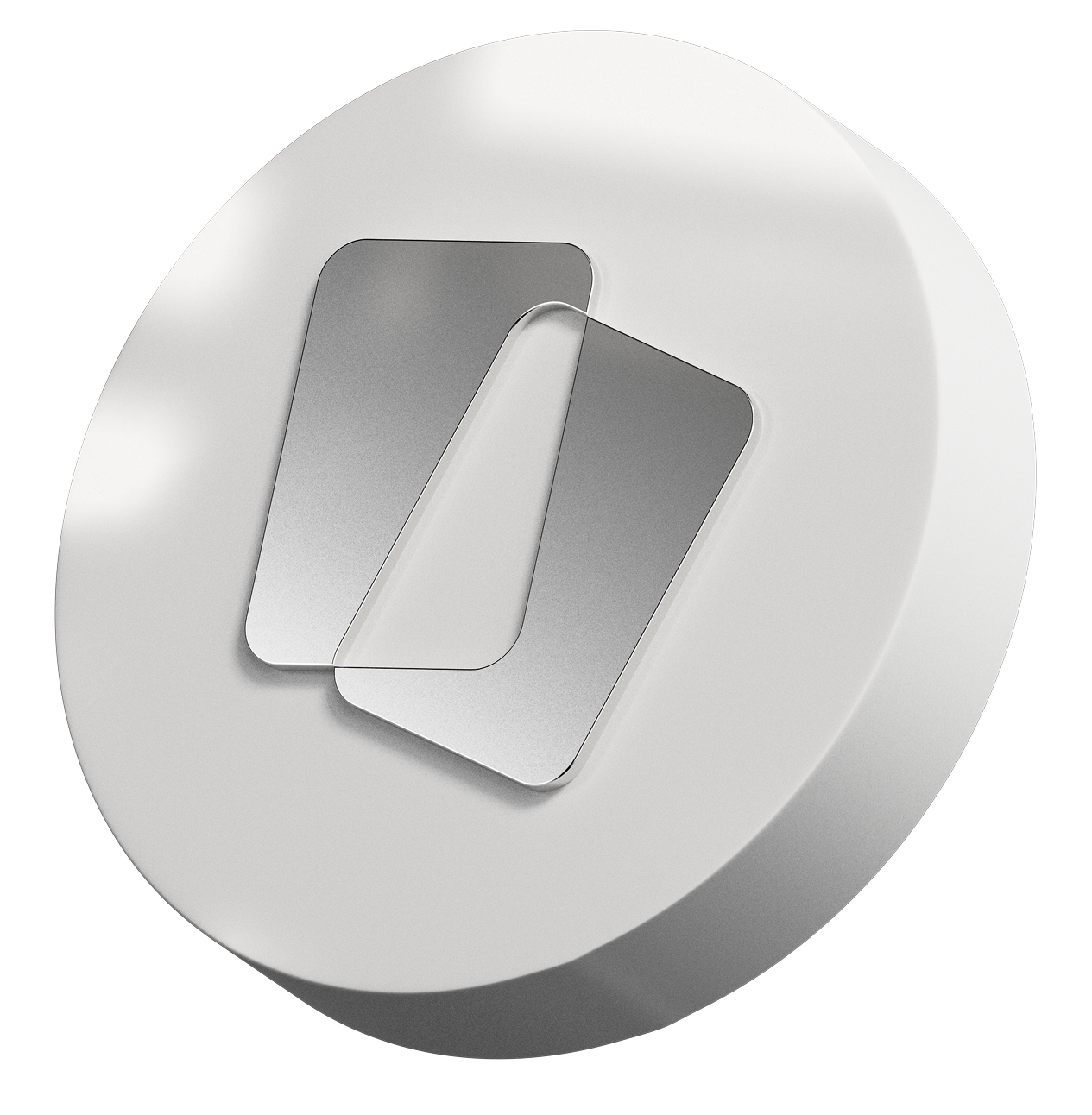
3D renders for decks, social posts and hero shots — shadows and grain are baked in.
Color
Click any swatch to copy its hex. Tokens are also available as CSS variables or JSON.
Sticker pills
The brand's sticker labels. Click a pill and type to try your own copy, then grab the CSS.
/* Adside sticker pill */
.adside-pill {
  display: inline-block;
  padding: 1px 0; /* 1px gradient border, top & bottom only */
  border-radius: 25px;
  background: linear-gradient(180deg, #FFFFFF 0%, rgba(0, 0, 0, 0.5) 100%);
}
.adside-pill > span {
  display: inline-block;
  padding: 16px 19px;
  border-radius: 24px;
  font-family: 'Sharp Grotesk DB', sans-serif;
  font-weight: 600;
  font-size: 54px;
  line-height: 1;
  white-space: nowrap;
  text-shadow:
    0 0.4px 0.4px rgba(0, 0, 0, 0.15),            /* drop shadow */
    -0.2px -0.2px 0.2px rgba(255, 255, 255, 0.25); /* inner highlight */
}

/* Colorways */
.adside-pill--sky      > span { background: #A8E1F8; color: #0144F5; }
.adside-pill--blue     > span { background: #0144F5; color: #A8E1F8; }
.adside-pill--pink     > span { background: #FFD5F3; color: #390507; }
.adside-pill--bordeaux > span { background: #390507; color: #FFD5F3; }
Typography
Sharp Grotesk carries headlines; Geist carries body and UI.
Textures
The contour-line grounds used across the site and decks. Lay them over electric blue at full opacity.
Using the kit
Four rules cover almost everything. When in doubt, ask in #design.
Ink or blue logo on light grounds; the white logo on electric blue, bordeaux or photography. Never blue-on-bordeaux or blue-on-pink.
Keep at least the height of the flag mark clear on every side. Minimum width 120px for the wordmark, 24px for the mark.
Recolor, stretch, outline, rotate or add effects. The files on this page are the only approved versions.
Electric blue leads — backgrounds and CTAs. Sky blue, pink and bordeaux are accents and section grounds, never tints of the logo.