Guides 19 min read

How to create ad designs with Claude Design: one brand system, every format

Claude Design gets ad creatives right on the first pass more often than anything else we've used, because it designs in code with your real fonts and logos. The work is in the setup and the ask. Here's the whole process, from brand files to a gallery of every format with copy, safe zones and downloads, and then into Claude Code.

To create ad designs with Claude Design, build the brand's design system first (real font files, logos, colors, voice rules), then ask for one gallery page that renders every ad concept in every aspect ratio you buy, with the Meta ad copy, a safe-zone overlay and per-format PNG downloads. Review it with pinned comments and global rules in chat, then hand the project to Claude Code when you want an agent to regenerate or launch it.

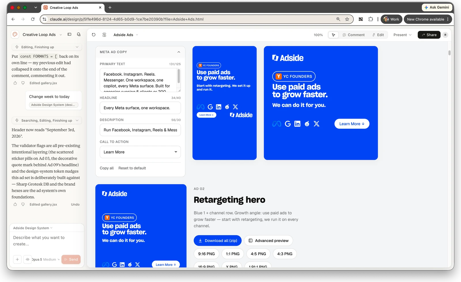
That's the process we used for Adside's own ads: a handful of concepts, each rendered in seven formats, with the copy block and the downloads living on the same page as the artboards. The screenshot below is that project. Everything in this guide is what it took to get there, including the parts Claude Design doesn't do for you.

The short version

  • Claude Design designs in code, which is why the ads look right. Type is real type in your real font, logos are your SVGs, and every format is the same component at a different size. No garbled words, no lookalike logo.
  • Build the design system before you generate a single ad. Upload the font files, every logo variant, the textures and the photos, and write the voice rules down. Anything made before the system exists is throwaway.
  • Ask for a gallery, not an ad. One prompt: N concepts, every aspect ratio, shared primitives, a copy block with counters at 125 / 40 / 25, a safe-zone toggle, and PNG downloads per format.
  • Meta's 9:16 safe zone is 14% top, 35% bottom, 6% sides. Same numbers for Stories and Reels now. Put them in one registry that both the layout and the overlay read, so copy can't land in the caption band.
  • Fix locally with comments, fix globally with chat. "Never use em dashes" or "don't say X, say Y" in the chat updates every concept in every format, because the copy lives in one file.

Why Claude Design for ad creatives

Claude Design is an Anthropic Labs product, launched on April 17, 2026, that produces designs, prototypes and slides as live code rather than as images.¹ It runs at claude.ai/design and in Claude Desktop, and it's included in Pro, Max, Team and Enterprise plans.² The layout is chat on the left, canvas on the right, and there are three ways to change what you see: talk to it, pin a comment on an element, or edit directly on the canvas.²

The reason it works for ads is the "as code" detail. An image model draws a picture of an ad: the headline is a picture of text, the logo is a picture of a logo, and both are slightly wrong. Claude Design sets your headline in your actual font file, places your actual SVG and lays your actual photo into a grid. A static performance ad is mostly a headline, a proof element, a logo and a photo on a brand background, so the first render is usually usable. The tenth render of an image model usually still has a typo.

Four things make it fit ad production, and they're what this guide is built around:

  • Shared components. Every ad is built from the same primitives (headline, lockup, proof row, CTA pill), so the same concept in 9:16, 4:5 and 1:1 is one component at three sizes, not three files that drift apart.
  • Comments pinned to elements. You click the thing that's wrong, write the note, and send a batch of notes to Claude at once.² That's how a client review already works, except the fix happens in the same place.
  • Rules in chat that apply everywhere. "Never use em dashes" or "Don't say we can do it for you, say we run it for you" changes every headline on every artboard in one go, because the copy lives in one file.
  • Handoff to Claude Code. The project exports to a coding agent through the Claude Design MCP server, so the same components can regenerate a set for the next client or push creatives straight to Meta.²

Two limits to know before you start. It doesn't generate photographs; Claude builds visuals in HTML and SVG, so you bring the product shots and the founder photos.¹⁸ And the export menu has no PNG option: it offers a zip, PDF, PPTX, standalone HTML, Canva and Claude Code.² Ad creatives need one PNG per format, so the gallery has to build its own download buttons. That's in the prompt in step 2.

Volume is why this matters. Motion's 2026 benchmarks, from 578,750 creatives across 6,015 Meta accounts, put the median mid-size account at 8 to 12 new creatives a week, enterprise accounts at nearly 19, and the winner rate at about 5%.¹³ Meta reported more than 8 million advertisers using its generative AI creative tools in the first quarter of 2026.¹⁴ Five concepts in seven formats is 35 files. By hand in Figma that's a day. From one gallery it's a review.

Step 1: Build the design system before you ask for an ad

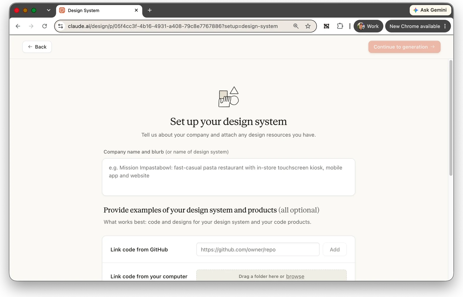
Claude Design has a first-class object for this. You upload the assets that define the brand, it generates a design system (palette, typography, components, layout patterns), you review it, and you switch on Published. Every project you create in that organization then inherits it, and a design-system dropdown lets you pick it explicitly.³ Accepted sources include a codebase, design files, screenshots, "a well-designed PowerPoint or PDF", and individual assets like logos and type specimens.³

What to upload, and why each thing matters:

AssetFormatWhy it matters
Logo, every variantSVG in black, white and brand color, plus a PNG mark and app iconThe model can only place a logo it has. A redrawn logo is the fastest way to look fake.
Fonts, the actual files.woff2, .otf or .ttf, every weight in useA named font without the file renders in a substitute. Type is what makes a set look like your brand instead of like "an AI ad".
Colors with rolesHex values: primary, ink, accent, backgroundsStops invented shades. "Blue" is not a spec.
Decorative assetsTextures, scribbles, stickers as transparent PNGThese carry the visual idiom across formats. Ours are six brush and coil textures; they're what make an Adside ad recognizably ours.
PhotosProduct, team, screenshots, at the largest size you haveClaude Design lays out; it doesn't photograph.
ProofPartner and platform logos, review badgesMost performance ads carry a proof row. Provide the real marks.
Voice rulesA short written listBecomes a global constraint on every headline. See below.
Angles3 to 6 one-linersEach angle becomes one concept rendered in every format.

For Adside that meant the Sharp Grotesk and Geist font files, three logo colorways, six textures, six photos and four partner logos. If the preview says "Missing brand fonts" and offers an Upload fonts action, stop and upload them. A substitute font is the most common reason a first set looks generic, and everything made with one gets redone the day the real font arrives.

The voice rules are the part people skip, and the part that saves the most review time later. Ours are short:

Full sentences, contractions, plain words. Never use em dashes. Use a colon, a period or parentheses instead. Never use: leverage, streamline, empower, unlock, transform. Say "we run it for you", not "we can do it for you". No invented numbers, no ROAS figures, no testimonials. Only these approved claims: [list]. CTA vocabulary: "Learn more", "Book a call".

Paste those into the design-system chat with the font and color roles, and ask for one tokens file plus a one-page voice reference. The full brief template is in the runbook. To change the system later, use Remix: a chat with the system itself rather than with any one project.³

Anything you generate before the design system exists is a sketch you'll redo. Fonts, logos and voice rules first. Ads second.

The mistake most people make is asking for an ad. You get a nice ad. You ask for it in 9:16 and get a different nice ad. What you want is one page holding every concept in every format, built from shared parts, with the copy and the downloads next to the renders. Ask for that in the first message and you spend the rest of the session reviewing instead of re-describing.

Here's the prompt, trimmed. The full version with placeholders is in the runbook:

Build an ad gallery page for Adside using the Adside design system. Concepts: 5, one per angle: [retargeting hero] [every Meta surface] [YC founders] [proof wall] [offer]. Each concept gets a name, a one-line rationale and one visual idea. Formats: render EVERY concept in 9:16 (1080×1920), 4:5 (1080×1350), 1:1 (1080×1080), 16:9 (1920×1080), 1.91:1 (1200×628) and 4:3 (1440×1080). Build the ads from shared primitives (headline, subhead, logo lockup, proof row, CTA pill, sticker label, texture) so changing a primitive or a line of copy changes every ad. Derive sizes from min(width, height)/1080 and positions from the safe area. Never hand-position per format. Safe zones: one registry, used by BOTH the layout and an overlay toggle that draws the unsafe bands in translucent red with the pixel values: 9:16 top 14% bottom 35% sides 6% (Meta official) · 4:5 top 6% bottom 10% sides 5% · 1:1 same · 16:9 top 6% bottom 12% sides 6% · 1.91:1 top 6% bottom 10% sides 5%. Ad copy: above each concept, a collapsible "Meta ad copy" block: Primary text, Headline, Description, CTA dropdown (Learn More, Sign Up, Book Now, Shop Now, Get Quote, Contact Us, Download, Subscribe). Live counters at 125 / 40 / 25 that turn red when exceeded but never block typing. "Copy all" and "Reset to default". All copy in one file. Downloads: on each concept, one PNG button per format at canvas resolution plus "Download all (zip)". Filenames: adside_{concept}_{ratio}_{w}x{h}.png. Copy rules: follow the voice page. Never use em dashes. Only approved claims. Headlines 3 to 7 words, one idea each.
The Adside ad gallery in Claude Design: a Meta ad copy panel with primary text, headline, description and CTA fields showing character counters at 131/125, 34/40 and 56/30, next to blue ad artboards, and a concept card with Download all (zip), Advanced preview and per-format PNG buttons for 9:16, 1:1, 4:5, 4:3, 16:9, X and 1.91:1
Our gallery. Copy block with counters on the left, renders in the middle, one download button per format under each concept. The chat on the far left is where the global rules go.

Why each piece is in there:

  • Shared primitives and derived sizes. This turns "make it 9:16" from a redesign into a resize, and it's what makes step 4 possible: a rule can only apply everywhere if everywhere is the same code.
  • The copy block with counters. Meta recommends 125 characters of primary text, 40 for the headline and 25 for the description; longer text still delivers but gets truncated, and where depends on the placement. Our block used 30 for the description because Meta's Marketplace spec says 30. The counter going red at 125 has caught more problems than anything else on the page. The CTA dropdown should list Meta's real buttons, since the media buyer picks from that same list in Ads Manager.
  • The safe-zone toggle. Step 3 has the numbers. The important word in the prompt is "BOTH": one registry that the layout and the overlay read. If the overlay keeps its own copy of the numbers, they disagree within a week.
  • Per-format downloads. Because there's no PNG export in the menu.² The buttons render the artboard to a PNG at canvas resolution in the browser. Ask for the filename pattern too, or you get "download (14).png" seven times.

The formats themselves depend on what you buy. Here's what the ratios map to, with Meta's current recommended pixels:

RatioCanvasWhere it runs
9:161440 × 2560 (1080 × 1920 accepted)Facebook and Instagram Stories, Reels, Audience Network.
4:51440 × 1800Facebook Feed. Meta now recommends 4:5 over 1:1 for single-image Feed ads. LinkedIn vertical at 720 × 900.¹¹
1:11080 × 1080 (1200 × 1200 for LinkedIn, X, Marketplace)Instagram Feed images, Marketplace, right column, LinkedIn, X.
16:91920 × 1080Facebook in-stream, X, YouTube, decks.
1.91:11200 × 628 (X recommends 2064 × 1080)LinkedIn landscape, X, Google Display.¹¹¹² Not a recommended Meta ratio.
4:31440 × 1080No paid placement. We keep it for decks and blog art; drop it if you don't.

On the first render, check five things and nothing else: the fonts and colors are yours (open one 9:16 at 100%), nothing sits in a red band with the toggle on, the counters read correctly, the 9:16 download is actually 1080 × 1920, and the filenames follow the pattern. Don't review copy yet. Structure first, words second.

Step 3: Safe zones, with the numbers

Meta publishes exact safe-zone numbers for one format only. For 9:16 ads in Stories and Reels, keep roughly 14% of the top, 35% of the bottom and 6% of each side free of text, logos and key creative elements; with a disclaimer, leave the bottom 40% free. Stories used to be 20% at the bottom, and that older wording is still live on some Instagram help pages. Design to 35%: one 9:16 asset serves both placements, and the Reels caption, audio row and engagement column eat the bottom third.

9:16 bandShareOn 1080 × 1920On 1440 × 2560
Top14%269 px358 px
Bottom35%672 px896 px
Bottom, with a disclaimer40%768 px1024 px
Each side6%65 px86 px
Usable area950 × 979 px1267 × 1306 px

For everything that isn't 9:16, Meta only says to keep the bottom and side edges free of key elements, with no numbers. So the rest of the registry is a house rule, and we label it that way in the overlay so nobody mistakes it for a platform spec:

FormatTopBottomSidesStatus
4:5 Feed6%10%5%House rule
1:16%10%5%House rule
16:96%12%6%House rule
1.91:16%10%5%House rule. LinkedIn and X overlay no UI on feed images.

Ads Manager has a Safe Zone Guardrail toggle that draws the same area as a yellow overlay at upload time. It's a fine last check and a terrible first one, because by then the set is done. Enforce safe zones in the layout primitive instead: a headline block positioned from the safe area rather than the canvas edge cannot land under the caption, on any format, however many concepts you add later.

Related: Meta no longer limits how much text an image can carry. The old 20% rule and the text-overlay tool are gone; the live guidance is legibility (a clean font, large enough, in a contrasting color) and staying inside the safe zone.¹⁰ Headline-led statics are fine. Headline-led statics with the headline under the Reels caption are not.

If the safe zone lives in a checklist, someone will ship a headline under the Reels caption. If it lives in the layout primitive, they can't.

Step 4: Comments for fixes, chat for rules

Claude Design gives you two ways to change a design. Using the right one for each kind of change is most of what separates a two-hour review from a two-day one.

Comments are for local fixes. Switch to Comment mode, click the element that's wrong, and write the note where it belongs: "logo too small here", "this photo crops badly at 9:16", "swap this sticker for the coil texture". Each pinned comment has a checkbox, so you batch a whole round of notes and send them to Claude at once.² Share the project inside your organization and a client review works the same way: they comment where they see the problem, the fix happens on that artboard.

Chat is for rules. Because the copy lives in one file and the ads share primitives, an instruction in the chat changes every concept in every format. The form to use is a rule, not a fix:

Never use em dashes anywhere. Replace the ones you used with a colon or a period. Don't say "we can do it for you". Say "we run it for you". Apply everywhere. Every headline must fit on two lines at 9:16. Shorten the ones that wrap to three. Move the logo lockup into the top safe band on every 9:16. Never in the bottom 35%.

A small example from our session: we asked it to change the header from the week to today's date. It did, and it reported which validator warnings it had deliberately left alone (the scattered sticker pills on one concept, a decorative quote mark behind a headline) because they were intentional layering against the design system. That's what you want from a reviewer: do the thing, and say what you chose not to touch.

Three rounds is the budget. Round one is structure and safe zones, round two is copy, round three is polish: alignment, sticker placement, photo crops. After that, a new concept beats a fourth pass on an old one. Never accept, at any round: invented statistics, testimonials nobody supplied, platform logos the brand has no relationship with, text inside a red band, a substitute font.

One known issue worth knowing: comments can occasionally disappear before Claude reads them. If a round of notes doesn't land, paste the feedback into the chat instead.²

Step 5: Export to PNG today, to Claude Code when you want to automate

For today's upload, use the download buttons the gallery built: one per format, or the zip. Then check the delivered file rather than the artboard. Open the 9:16 PNG, confirm it's 1080 × 1920 (or 1440 × 2560), confirm nothing sits in the bottom 35%. Upload it to Ads Manager with the copy from the copy block, or drop the whole zip into a bulk launch so the naming convention is applied on the way in.

For everything after today, hand the project to a coding agent. In the export menu, choose Handoff to Claude Code, then Send to local coding agent. Claude Design gives you an import prompt; in Claude Code, add the Claude Design MCP server and authorize it, then paste the prompt.²

claude mcp add --scope user --transport http claude-design https://api.anthropic.com/v1/design/mcp /design-login # then paste the prompt Claude Design generated, which looks like: Use the claude_design MCP (https://api.anthropic.com/v1/design/mcp, auth via /design-login) to import this project: https://claude.ai/design/p/<project-id>?file=Adside+Ads.html Focus on these files: Adside Ads.html, assets/… (fonts, logos, textures, photos) Also read the files the selection imports: ad-copy.jsx, ad-primitives.jsx, ads-a.jsx, ads-b.jsx, ads-c.jsx, ads-banners.jsx, ads-videos.jsx, placements.jsx, gallery.jsx, colors_and_type.css, gallery.css Implement: the selected files

Notice the file list. It's the structure from step 2 made literal: all the copy in ad-copy.jsx, the shared components in ad-primitives.jsx, the formats and safe zones in placements.jsx, one file per concept group. Once that's local, an agent can swap the tokens and copy files to produce a set for the next client, render every format headlessly, and push the creatives to Meta through Meta's own MCP server or hand them to Adside to launch and monitor. We've covered connecting a Meta Ads MCP to Claude separately. Claude Code's /design skill goes the other direction, seeding a canvas of artboards from code you already have.¹⁷

The safe-zone registry earns its keep again here: the same fractions drive our video ads in the Remotion pipeline, so a static and a video for the same concept obey the same bands without anyone checking.

What goes wrong

  • Generating ads before the design system exists. You get plausible ads in a substitute font with a redrawn logo, and you redo all of them. Build the system, publish it, then start.
  • Asking for one ad at a time. Each ask is a fresh design with nothing shared, so a copy change means seven edits. Ask for the gallery.
  • Letting the model invent claims. It will offer a "4.8 stars from 2,000 reviews" if you don't give it real proof. Put the approved claims in the voice rules and reject anything outside them.
  • Discovering safe zones in Ads Manager. The yellow guardrail overlay is the last place to learn your headline is under the caption. Put the numbers in the layout.
  • Expecting a PNG export. There isn't one in the menu. Ask for download buttons in the page, and check the file they produce.
  • Reviewing in the wrong channel. Pixel nudges in the chat and global rules in comments both waste a round. Comments for the local, chat for the general.

Behind all six is the same point. A 2025 Monotype study of 1,008 creative professionals found 57% spend more than a quarter of their time on asset management, compliance checks and workflow bottlenecks.¹⁶ Resizing one ad into seven formats and retyping the copy into a spreadsheet is that work. Two in three video ad buyers already use generative AI for creative.¹⁵ The question isn't whether to use a tool like this. It's whether you set it up so the second set costs a tenth of the first.

Frequently asked questions

Can Claude Design create Facebook and Instagram ads?

Yes, as long as you treat it as a layout tool rather than an image generator. Claude Design builds designs as live HTML and CSS, so it sets your real fonts, places your vector logos and lays out your photos exactly, which is what most static performance ads are. It does not generate photographs, so bring your own product shots. Build the brand's design system first, then ask for one gallery page that renders every concept in every aspect ratio you buy.

Does Claude Design export PNG files?

Not from the export menu. The built-in options are Download as .zip, Export as PDF, Export as PPTX, Export as standalone HTML, Send to Canva and Handoff to Claude Code. For ad creatives you need one PNG per format, so ask for download buttons inside the gallery page itself: one per aspect ratio at the canvas resolution, plus a download-all zip. Check the delivered file, not the artboard, before uploading.

What are Meta's safe zones for Reels and Stories in 2026?

For 9:16 ads in Stories and Reels, Meta says to keep roughly 14% of the top, 35% of the bottom and 6% of each side free of text, logos and key creative elements. On a 1080 by 1920 canvas that is about 270 pixels at the top, 672 pixels at the bottom and 65 pixels on each side. If the ad carries a disclaimer, leave the bottom 40% free. Stories and Reels now share the same numbers, so design one 9:16 asset to the 35% rule.

Which aspect ratios do I need for Meta ads?

Three cover almost everything: 9:16 at 1440 by 2560 for Stories, Reels and Audience Network, 4:5 at 1440 by 1800 for Facebook Feed (Meta now recommends 4:5 rather than 1:1 for single-image Feed ads), and 1:1 at 1080 by 1080 for Instagram Feed images, Marketplace and the right column. Add 16:9 for in-stream and 1.91:1 at 1200 by 628 if the same set runs on LinkedIn or X. 4:3 is not a Meta ratio at all.

How long should Meta primary text, headline and description be?

Meta's recommendation for most placements is 125 characters of primary text, 40 for the headline and 25 for the description (its Marketplace spec says 30). These are recommendations, not hard limits: longer text still delivers, it just gets truncated. Mobile Feed collapses primary text behind See more at about 125 characters, Reels shows about 44, and the Facebook Feed headline cuts at around 27. Build counters into your copy block that turn red past the recommendation without blocking typing.

Which Claude plans include Claude Design?

Claude Design is included in Pro, Max, Team and Enterprise plans. For Enterprise organizations it is off by default until an admin enables it in organization settings. It is not available on the Free plan, and it runs on the web at claude.ai/design or from the Claude Desktop sidebar, not on mobile. Since the June 2026 update it draws on the same usage pool as chat, Claude Code and Cowork rather than a separate weekly allowance.

Sources

  1. Claude Design launch, Anthropic Labs, code-rendered designs (April 17, 2026) — Introducing Claude Design, Anthropic
  2. Plans, three ways to refine, pinned comments and batch send, export menu, Handoff to Claude Code, MCP server and /design-login, known comment issue, shared usage limits — Get started with Claude Design, Claude Help Center
  3. Design system creation: accepted sources, generated palette/type/components, Published toggle, inheritance, Remix — Set up your design system in Claude Design, Claude Help Center
  4. 9:16 safe zone, 40% with disclaimers, non-9:16 guidance, Safe Zone Guardrail — About text overlays and the safe zone for ads in Stories and Reels, Meta Business Help Center
  5. Reels image specs, 1440 × 2560, 14% / 35% / 6% wording — Instagram Reels image ads, Meta Ads Guide
  6. Facebook Feed image ads, 4:5 at 1440 × 1800 — Facebook Feed image ads, Meta Ads Guide
  7. Aspect ratios supported and recommended by placement — Aspect ratios supported by placements in Meta Ads Manager, Meta Business Help Center
  8. Recommended text lengths 125 / 40 / 25 and truncation — Creative best practices for text in ads, Meta Business Help Center
  9. Call-to-action button inventory — Available call-to-action buttons in Meta Ads Manager, Meta Business Help Center
  10. No limit on text in images, legibility guidance — Best practices for image ads, Meta Business Help Center
  11. LinkedIn single image ad ratios, pixel sizes and text limits — Single image ads advertising specifications, LinkedIn Marketing Solutions Help
  12. X image ad sizes and text limits — Creative ad specifications, X Business
  13. Median weekly new creatives by spend tier, 5% winner rate (578,750 creatives, 6,015 accounts) — Creative Benchmarks 2026, Motion
  14. More than 8 million advertisers using Meta's generative AI creative tools, Q1 2026 — Meta Q1 2026 earnings call transcript
  15. Two in three video ad buyers use generative AI for creative (July 2026) — 2026 Digital Video Ad Spend & Strategy Report, IAB
  16. 57% of creative teams spend more than a quarter of their time on non-creative tasks (1,008 respondents, 2025) — Scaling Creative Operations, Monotype
  17. The /design skill in Claude Code (August 2026) — What's new, week 34, Claude Code docs
  18. Claude builds visuals in HTML and SVG rather than generating photographs — Can Claude produce images?, Claude Help Center
Robin Choy

Founder of Adside. Writes about the operational side of running ads at agency scale: what to automate, what to keep human, and what the data actually says.

From gallery to live ads

Adside takes the PNGs and the copy from a gallery like this one and launches them on Meta, LinkedIn and Google with your naming convention applied, then watches for fatigue so the next set is ready before this one wears out.