How to build a landing page for your ads? We analyzed every ad-specific landing page YC companies run
Most companies point paid traffic at their homepage. In the whole Y Combinator portfolio, only 3.6% of ad clicks land on a page built for the ad. We rendered every one of those pages. Here's the playbook they share, and how it changes by business type.
A landing page for an ad is a page built for one ad and nothing else. It says the same thing the ad said, it gives you one thing to do, and it hides your normal website menu so you don't wander off. Most companies never build one. They send their ad traffic to the homepage instead.
We know this because we checked. In our study of how all 6,055 Y Combinator startups advertise, we followed 78,348 live ads to see where they send people. Here is where the clicks go:
Two in five ads go to a homepage. Another third go to a normal product page. Only 3.6% go to a page built for the ad. In the whole group of 6,055 startups, just 69 companies build real landing pages for their ads. We opened every one of them. Below is what the good ones do, step by step, so you can copy it.
Here are a few real ones you can open right now:
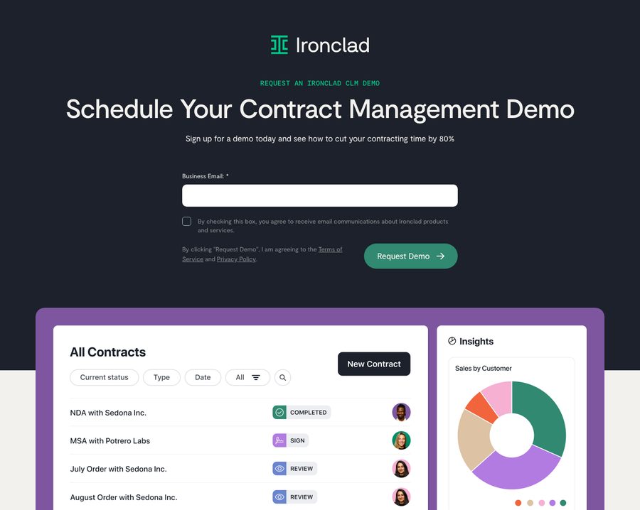
- Ironclad (contract software, wants you to book a demo)
- Stripe (payments)
- Guesty (software for rental hosts)
- CodeAnt AI (code security, free trial)
- Probably Genetic (a health quiz)
- AgendaPro (booking software, in Spanish)
And here is what two of them look like:
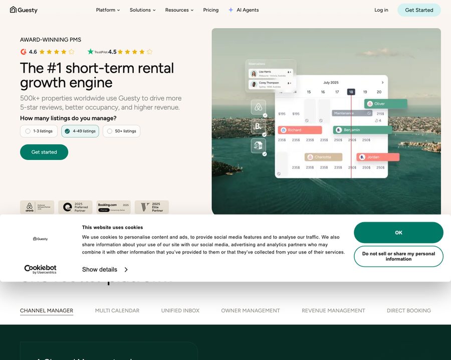
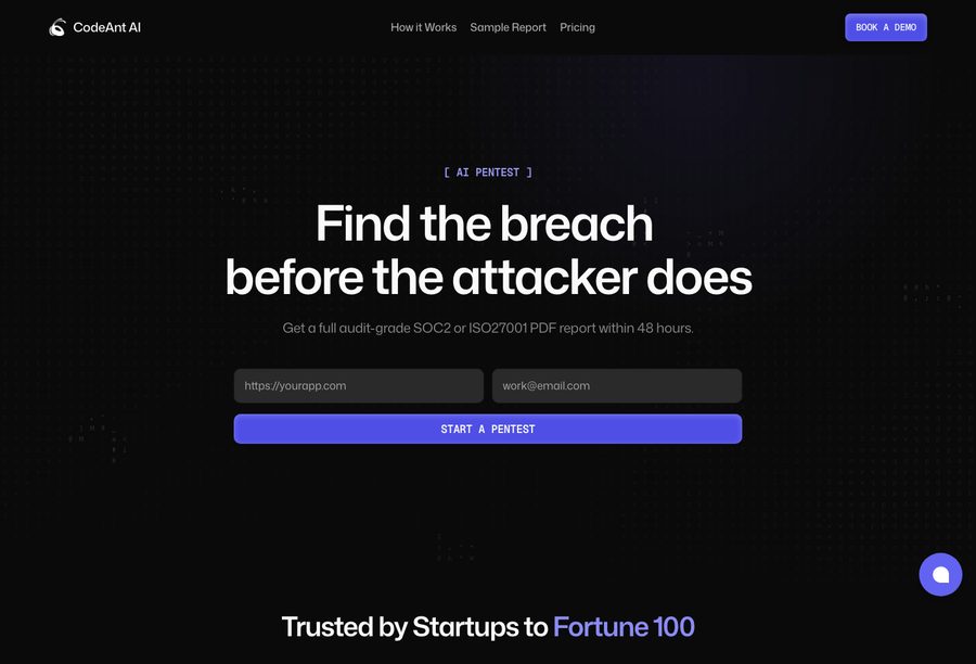
The short version
- Send ads to a page built for the ad, not your homepage. A homepage lets people wander. A landing page gives them one thing to do.
- Step one is to remove the exits. Cut the top menu down to your logo, and cut the footer down to Privacy and Terms.
- Say what the ad said. The first line of the page should match the promise in the ad.
- One button. Pick "Start free" or "Book a demo", not both as equals.
- Build one page per promise, and keep it alive. Don't make hundreds. 13% of the ones we found are already broken links.
Where your ad should go
When someone clicks your ad, they clicked because of one promise. The homepage makes them find that promise again, hidden among ten other things, next to a menu that invites them to leave. A page built for the ad keeps the promise front and center and takes the distractions away.
The numbers back this up. Unbounce, which builds landing pages, sees a middle conversion rate of 6.6%. WordStream, which measures the pages advertisers usually use (mostly homepages), sees 2.35%.¹² Different samples, so it is not a clean "three times better", but every source points the same way: a page built for the ad wins. Here is how to build one.
Step 1: Remove the exits
A homepage is full of links: the menu across the top, the big footer at the bottom, buttons everywhere. That is on purpose, because a homepage wants you to look around. A landing page wants the opposite. It wants you to do one thing, so it takes the extra links away.
The startups that build these pages do exactly that. On a homepage, the top menu has about 8 links. On their landing pages, it has 1: just the logo. The footer drops from about 30 links to about 6, usually only "Privacy" and "Terms". Three out of four of these pages also start with one big headline instead of a wall of text.
Here is the same company showing both. On the left is the landing page Gusto's payroll ads point to. On the right is the Gusto homepage. Same company, very different amount of stuff.
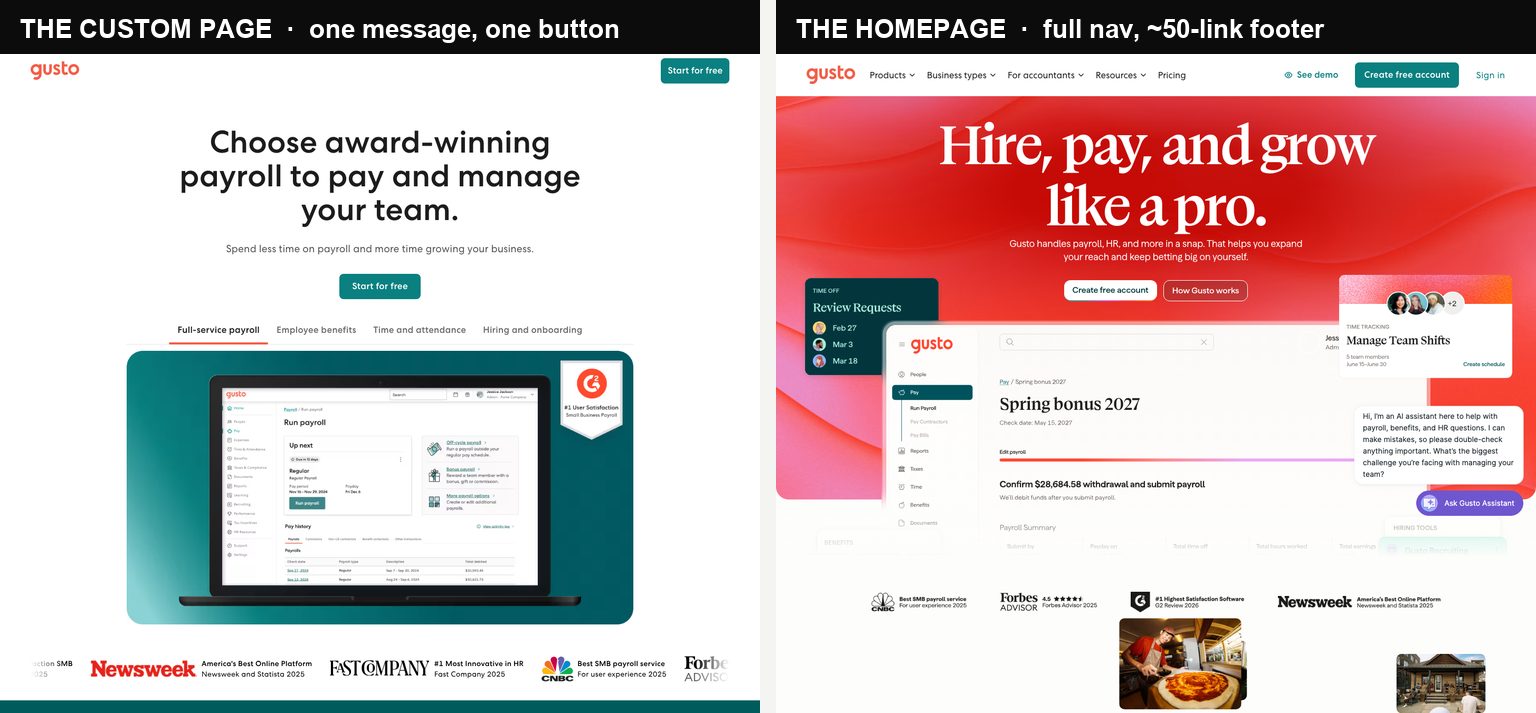
Why does this help? Because every extra link is a way out. HubSpot ran a test on its own pages: taking the menu off lifted sign-ups by 16 to 28% on the pages closest to a sale.⁴ Fewer exits, more people who finish.
Step 2: Say what the ad said
Whatever your ad promised, the top of the page should promise the same thing, in the same words. If the ad said "Free pentest, pay if critical", the first line of the page should be about that, not your company slogan. When the ad and the page match, people feel like they are in the right place and keep going. When they don't match, people leave.
This is the most important step, and it has the best proof behind it. A study in the journal Management Science found that pages which match the ad get more sign-ups and cost less per click.³ Look again at the CodeAnt page above: the ad said "Free pentest", the page opens with "Find the breach before the attacker does", and it ends with pricing. Same message, start to finish.
Step 3: Give one button
Pick one thing you want people to do, and ask for only that. "Start free." Or "Book a demo." Or "Get the report." If you put three buttons of equal size on the page, people pick none of them.
Unbounce looked at 18,639 pages. The ones with a single button did better (13.5% signed up) than the ones with two or three buttons (11.9% and 10.5%).⁵ You can still add a smaller second option lower down, but keep one clear main button.
Step 4: Make it fast, especially on phones
Most people click ads on their phone. If the page is slow to load, they are gone before they even see it. A simple one-purpose page is much easier to keep fast than your full homepage, which is one more reason to build it.
Google and Deloitte studied 30 million phone visits. Making a page load just 0.1 seconds faster raised sales by 8.4%.⁶ On a phone, speed is not a nice-to-have. It is most of the game.
Step 5: Keep it short
Say less. Every extra paragraph is another reason to stop reading and leave. In one clean test with 27,083 visitors, a short 42-word page beat a long 278-word page: 42% of people signed up on the short one, against 29% on the long one.⁷
If you need a form, only ask for what you actually need. A shorter form gets filled out more often. Match it to the ask: an email address for a free trial, a bit more for a sales demo.
One bonus. A fast, matching, focused page also lowers what you pay per click on Google. Google gives cheaper clicks to pages it thinks give people a good experience.⁸ So a better page can save you money on ads before it wins you a single extra customer.
Pick the right kind of page for your business
The five steps are the same for everyone. What changes is the shape of the page, and the main thing that decides the shape is what you sell. Here is how the 155 pages we could open split up, and what each kind of business tends to build.
| Business type | Pages | Asks for a demo | Has a form | What the page usually is |
|---|---|---|---|---|
| Software (B2B) | 91 | 42% | 58% | A demo request, or a free trial |
| Fintech | 22 | 41% | 68% | An open-an-account form |
| Healthcare | 17 | 12% | 6% | A quiz |
| Shops & consumer apps | 12 | 8% | 33% | An offer or a first purchase |
| Courses & training | 9 | 0% | 100% | A sign-up form |
Ironclad sells contract software to big companies, so its page is built to book a sales call: no menu, one form, one "Request Demo" button, then customer logos and reviews.
But a demo button is not the default, even for business software. CodeAnt AI sells to the same kind of buyer and chose the opposite: no sales call, just "start now" and clear pricing on the page. Two similar companies, two different choices, both fine.
Fintech pages look like business pages but ask for more, because you are opening an account. Brex and Alaan each cut their whole product down to one thing on the ad page (a card, a business account) instead of showing everything.
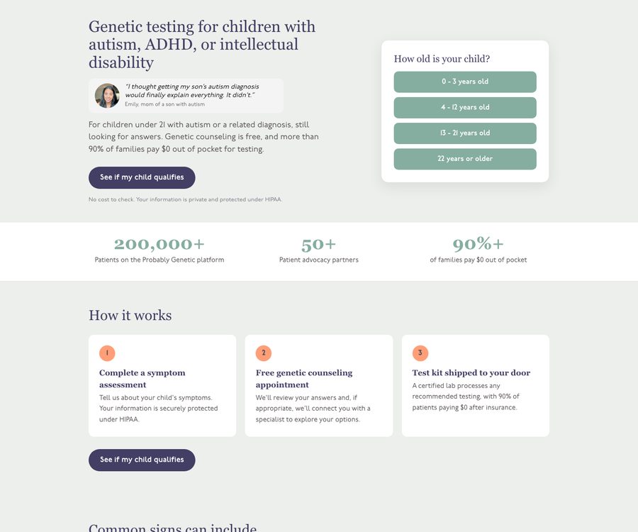
Health companies do something different. Most don't ask for a demo, or even a form up front. They run a quiz. Probably Genetic turns the ad's question straight into the page's headline, then asks "See if my child qualifies." The form comes later, once you care.
Shops and consumer apps keep it simple: one offer, one first purchase. "Dinner is handled." "$40 off your first order." One warning that goes against everything above: if you sell products and your product page already has photos, reviews and a buy button, send the ad straight there. A separate landing page just adds a step.
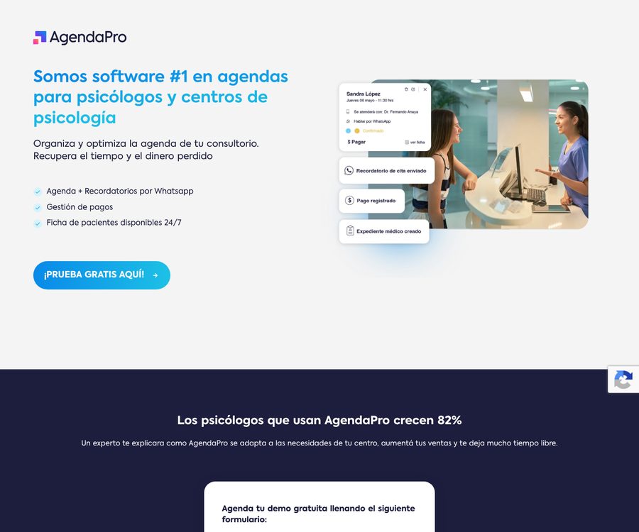
Course and training companies build the simplest pages of all. Every one is a sign-up form. AgendaPro even builds a different page for each type of customer, in their language: the page for psychologists talks about psychology clinics, the page for salons talks about salons. That is Step 2 taken all the way.
Do you need a "book a demo" button?
People assume a business page has to push you into a sales call. Most don't. Across all these pages, only about a third have a "book a demo" or "talk to sales" button. The other two thirds let you start on your own.
The rule is simple. If someone can use your product without talking to anyone, let them, and make "Start free" the main button. If buying really needs a conversation (a big contract, a few people signing off), then a demo button and a form make sense. The common mistake is picking "book a demo" because it feels serious, when your product is something people could just try. We go deeper in our piece on free trial versus book a demo, and on what a demo actually costs to get.
Two mistakes to avoid
The first mistake is building too many pages. Some guides tell you to make one page for every keyword. Don't. More than half the companies that build a landing page build just one. A pile of pages is a pile of things to keep updated.
The second mistake is letting pages die while the ads keep running. Out of the 187 pages we found, 25 are already broken links (a "404" error page). The ad is live, the money is being spent, and the page is gone. Ironclad has ads pointing at old pages that no longer exist, and CodeAnt has four. When a campaign ends, turn the ad off before the page disappears. It is the easiest fix here, and the one people skip most.
Here is the real lesson from all 6,055 startups: most of them, even ones spending a lot on ads, send that traffic to a homepage. The 69 who build a real page are the ones who decided the click was worth it. That choice matters more than any design trick.
Frequently asked questions
Should ads go to a landing page or the homepage?
For any campaign with specific intent (paid social, non-branded search, a named offer), send the click to a dedicated landing page, not the homepage. A homepage is built to let people explore your whole company; an ad already made a specific promise, and the page should keep that one promise and remove everything else. The exceptions are branded search, where someone already knows you, and ecommerce product ads, where an optimized product page with reviews and a cart is usually the better destination than a separate page.
What makes a good landing page for ads?
Four things, in order: the headline restates the promise the ad made (message match), the site navigation is stripped so there is nothing to click away to, there is one primary action instead of three competing ones, and the page loads fast on mobile because most ad traffic is mobile. Everything else (social proof, a short form, pricing) supports those four. Across the YC companies that build dedicated pages, 77% strip the navigation and 74% lead with a single clear headline.
Should a B2B landing page say "book a demo" or "start free"?
It depends on how your product is bought, and the honest answer from the data is that most do not gate on a demo. Only about a third of the YC custom pages offer a "book a demo" or "talk to sales" path; roughly two thirds lead with self-serve ("start free", "sign up", "get started"). Use a demo CTA when the product genuinely needs a sales conversation to buy, an annual contract or a multi-stakeholder deal. Use self-serve when someone can get value alone. Many strong pages offer both: a primary "start free" with a secondary "talk to sales" for the buyers who want it.
How many landing pages do I need?
Fewer than the marketing blogs suggest. Build one page per distinct promise or audience, not one per keyword. More than half of the YC companies that build dedicated pages run exactly one. The "500 pages for 500 keywords" approach creates a maintenance burden that ends in dead links: 13% of the YC custom pages we found already return a 404 while their ads are still running and spending. Ten pages you maintain beat fifty you forget.
Do dedicated landing pages actually increase conversion rates?
Usually yes for campaign traffic, but the direction of the effect is far better supported than the specific numbers. Nearly every "landing pages convert 3x better" statistic comes from a company that sells landing-page software, and advertisers who build pages also tend to run tighter campaigns, so benchmarks cannot cleanly separate the page from the team. What holds up independently is the mechanisms: message match, removed navigation, a single call to action, and page speed all have real evidence behind them. Treat every round-number lift claim as directional, and A/B test the page against your current destination before you scale spend.
What should the footer of an ad landing page include?
Almost nothing. A homepage footer carries 30 to 50 links across product, company and resources columns; a good ad landing page cuts that to a median of about six, usually just a privacy policy, terms, and a copyright line. The point of a landing page is to remove exits, and the footer is a wall of exits. Keep the legal links you need (privacy and terms), drop the full sitemap, the careers links, the social icons and the newsletter box. Among YC startups, only 6% keep a "Backed by Y Combinator" badge on these pages.
Sources
- Median landing-page conversion rates by industry and channel — Conversion Benchmark Report, Unbounce
- Google Ads destination-page conversion benchmarks — Search Advertising Benchmarks, WordStream / LocaliQ
- Landing-page quality linked to conversion and cost per click — Ghose & Yang, "An Empirical Analysis of Search Engine Advertising", Management Science (2009)
- Removing navigation from landing pages, A/B tested — Should You Remove Navigation From Landing Pages?, HubSpot
- Single call-to-action versus multiple links — Landing page link analysis, Unbounce
- Mobile load time and conversion, 30M+ sessions — Milliseconds Make Millions, Deloitte for Google
- Randomized field experiment on landing-page content volume — Gafni & Dvir, "How Content Volume on Landing Pages Influences Consumer Behavior" (2018)
- Landing-page experience as a Quality Score component — About Quality Score, Google Ads Help